branding elements
In this media kit, you’ll find the essential resources for accurately representing the TubeBuddy brand. Explore our brand colors, logo variations, and guidelines to ensure consistency and authenticity in your TubeBuddy-related content. We appreciate your commitment to upholding our brand identity.
"*" indicates required fields
correct logo usage
Check out our guidelines on how to correctly utilize the logo variations to maintain the integrity and recognition of the TubeBuddy brand.
wordmark on light background
wordmark on dark background

lettermark on light background
lettermark on dark background

The wordmark is shown with “by BENlabs” to emphasize the affiliation with our parent company.
The “e” in TubeBuddy provides the proper perimeter spacing distance around the logo as shown.
incorrect logo usage
Thank you for using the TubeBuddy logo properly. Here are a few examples of how the logo should not be presented..
don’t crowd the logo with other elements
don’t use the dark version of the wordmark on a dark background
don’t place the logo on top of really busy backgrounds
don’t squish or distort the logo
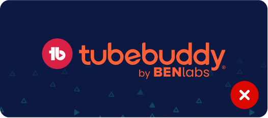
don’t use wrong colors for the logo
don’t use low resolution versions of the logo
color usage
These are our official brand colors. Note that we use both solid colors and gradients.
Text/Font Colors
For text/font colors, we use a near-black and an off-white.

#FAFAFF

#1D2327
Primary Colors
Used as the main/center of attention, the first color is meant for the main CTA color.

#4BEAD7

#4BEAD7
#4CAAED
#4CAAED

#4BEAD7
#A699E9
#A699E9
Secondary Colors
Used as secondary colors. Great for backgrounds and accent colors.

#D92145

#D92145
#BC25F5
#BC25F5

#D92145
#F89B29
#F89B29
Tertiary Colors
Used as accent colors on darker background colors. These won’t be used as often.

#88EB3E

#88EB3E
#60EFFF
#60EFFF

#88EB3E
#FFF95B
#FFF95B
Background Colors
Used for the main backdrop for text and images.

#0C1942

#28303D

#EFEFF0

#FAFAFF
color usage
Here are our official colors. They come in solids and gradients.
benefit headline
Largest focus body copy, meant for shorter statements, not long paragraphs.
We want to offer benefit-first language. Our main headlines tell a Creator why they need to keep reading. They are fully lowercase with the exception of proper nouns, the names of features, and the word Creator. There are no periods at the end, but could have other kinds of punctuation marks like question marks or exclamation marks.
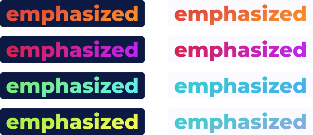
emphasized words
Sometimes, we really want to emphasize a particular word or two. In these rare cases, this is how we stylize those words.
